
NHL adidas Reverse Retro Jersey Rankings
All 31 Reverse Retro jerseys, ranked from worst to best
by Brendan Smith, Sports O’Clock Writing Team Member

(photo credits: NHL Twitter)
The NHL and adidas released their line of “Reverse Retro” jerseys for the upcoming 2020-21 season. The jerseys feature references to past logos and color schemes while remaining loyal to the current designs of each team. There are some great jerseys here, and there are some that make me question the creative ability of the people who designed them. Quick sidenote: if a team decided to revert to an old logo and color scheme completely, they got massive bonus points on this list if it was done well. Here we go…
(note: all photos are from the official NHL Twitter page unless otherwise marked)
31. Detroit Red Wings

I’m sorry, what? Is this the best thing adidas could come up with? I know the Red Wings have had the same uniforms for basically their entire history, but this is as bland as it gets.
30. Vegas Golden Knights

This jersey is horrible. The striping on the bottom is weird, and red does not look good with the regular gold and grey color scheme.
29. New York Islanders

This is basically the same as the Islanders regular jerseys. I think the shade of blue is a bit darker but that is not a significant change. They should have brought back the weird fisherman logo!
28. Winnipeg Jets

I like the old logo, but the color scheme is awful. Not including a single hint of red is a big mistake.
27. Chicago Blackhawks

The color scheme is decent, but there are few, if any, photos of the front of the jersey. That is probably an intentional move from the NHL.
26. Toronto Maple Leafs

I am not a fan of the logo or the massive stripe down the sleeves. This is a look back at the bad era of Maple Leafs jerseys that has thankfully been corrected in recent years.
25. Philadelphia Flyers

The sleeves are hideous. The only thing saving this jersey is the simplicity of the front with the simple black stripe around the bottom.
24. Edmonton Oilers

Like the Islanders, the Oilers decided to stick to a design that is extremely similar to what they already wear. They are higher up on the list than the other orange and blue team because this jersey is a throwback to the Wayne Gretzky days.
23. Nashville Predators

I am a big fan of the Predators current uniforms, but I am not very fond of this one. The white pattern that runs down the sleeves is a bit too much.
22. Dallas Stars

The old logo and the big star outline is a neat touch, but this jersey would be way higher in the rankings if the Stars reverted to their old black, green and gold color scheme.
21. Washington Capitals

I am going to say the same thing about the Capitals jersey as I did about the Stars jersey. The old logos are cool, but this design would look better in the old teal and black color scheme.
20. San Jose Sharks

This jersey is the definition of OK. The old logo is neat, but the jersey itself does not pop like some of the jerseys higher on the list.
19. Columbus Blue Jackets

The stars around the sleeve cuffs are pretty cool… but that is about it. Like the Sharks, the Blue Jackets did not do enough to make their jersey stand out, but they also did not make mistakes that would have ruined it.
18. Tampa Bay Lightning

Another middle of the pack jersey. As defending Stanley Cup champions, it is fitting the Lightning opted to include the logo from the first time they won the Cup in 2004.
17. Colorado Avalanche

I absolutely love that the old Quebec Nordiques logo and fleur-de-lis pattern are both used, but they look really weird in maroon rather than the red and blue of the Nordiques.
16. New York Rangers

The Rangers finally brought back their old Lady Liberty logo! The problem is they forgot to design the rest of the jersey. Some sort of shoulder or waist pattern would have put these jerseys in the top ten.
15. Minnesota Wild

This is a very nice-looking jersey. The old Minnesota North Stars color scheme is a nice alternative to the Wild’s regular red and green, and the sleeve pattern is not too cluttered.
14. Vancouver Canucks

I hated this jersey when it was initially released. After I had a day to think about it, I changed my mind. The fade design is really cool, and the blue and green pattern is much better than the old black, red, and yellow pattern the Canucks used to have.
13. St. Louis Blues

This jersey is awesome. It may look weird in today’s NHL, but I admire the decision to go with an actual throwback uniform instead of combining elements of the past with the Blues’ current uniforms.
12. Boston Bruins

(photo credits: USA Today Sports)
Gold uniforms are always great, and the Bruins' new look does not disappoint. The striping pattern is consistent on the sleeves and the waist, and the old B logo completes the slick look.
11. New Jersey Devils

Colorblind people may not like this one, but I think it is awesome. Going back to the green and red design was a great decision, even though that was the only true throwback option the Devils have.
10. Pittsburgh Penguins
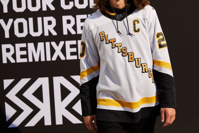
Diagonal wordmark logos are a risky option for the front of a jersey, but the Penguins nailed it. My only gripe is the 1990s and early 2000s Penguins triangular logo is omitted. That would have been a great logo to feature on the shoulder.
9. Calgary Flames

The horse head logo is definitely one of the most unique logos in NHL history. Combining that with a predominantly black jersey creates a very intimidating and classy look.
8. Montreal Canadiens

This jersey really isn’t anything more than a reversal of the Canadiens’ regular jerseys, but it still looks great. The Canadiens have a timeless jersey design, and that remains the same here.
7. Ottawa Senators
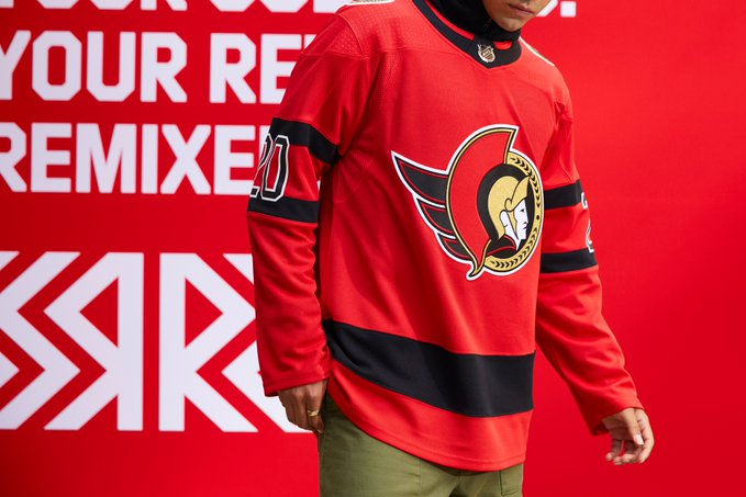
I am pretty sure I like this jersey more than most people, but the black and red color scheme works perfectly. Plus, I like the retro Senators logo a lot more than the silly cartoon one that has finally been replaced.
6. Anaheim Ducks

This jersey is the definition of stupid, but I love it. The Ducks have had several bizarre uniforms in their history, so why not go all out and create something ridiculous?
5. Florida Panthers

Why did the Panthers ever replace this logo? The leaping panther is a great symbol of hockey in Florida, and the design of the jersey around the logo is very clean. This might be the greatest Panthers jersey ever.
4. Carolina Hurricanes

(photo credits: The Athletic)
The Hurricanes decided to go all-in on the Hartford Whalers with this jersey and I applaud them for it. The Whalers had a great color scheme and design, and that is not lost in this iteration.
3. Los Angeles Kings

The purple and gold color scheme is incredibly slick and nostalgic, and it matches the famous colors of the NBA’s Los Angeles Lakers. If this is well-received by fans, the Kings should make this their regular uniform.
2. Buffalo Sabres

The crossed swords logo is definitely the coolest logo among all of these new uniforms. Plus, the Sabres have the old buffalo logo on the shoulders. Spectacular jersey here.
The Best: Arizona Coyotes

The Coyotes have the best “Reverse Retro” jersey and it’s not even close. The desert pattern around the bottom of the jersey is one of the coolest designs in the history of sports uniforms, and the old Coyotes logo in front of an all purple background is superb. The Coyotes are going to look amazing with this uniform when they take the ice.
(All photos are cited properly. No copyright infringement intended.)


Comments